1
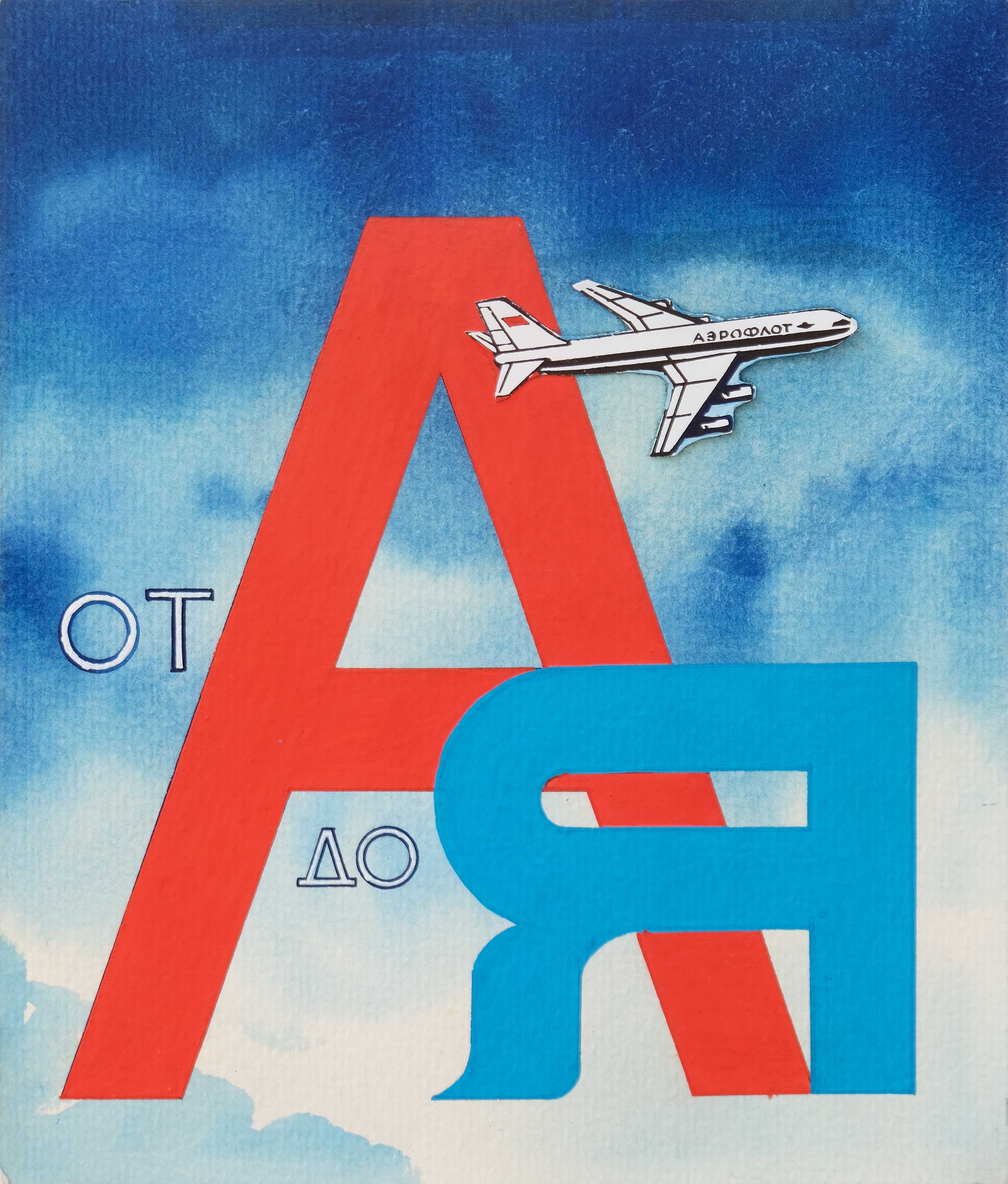
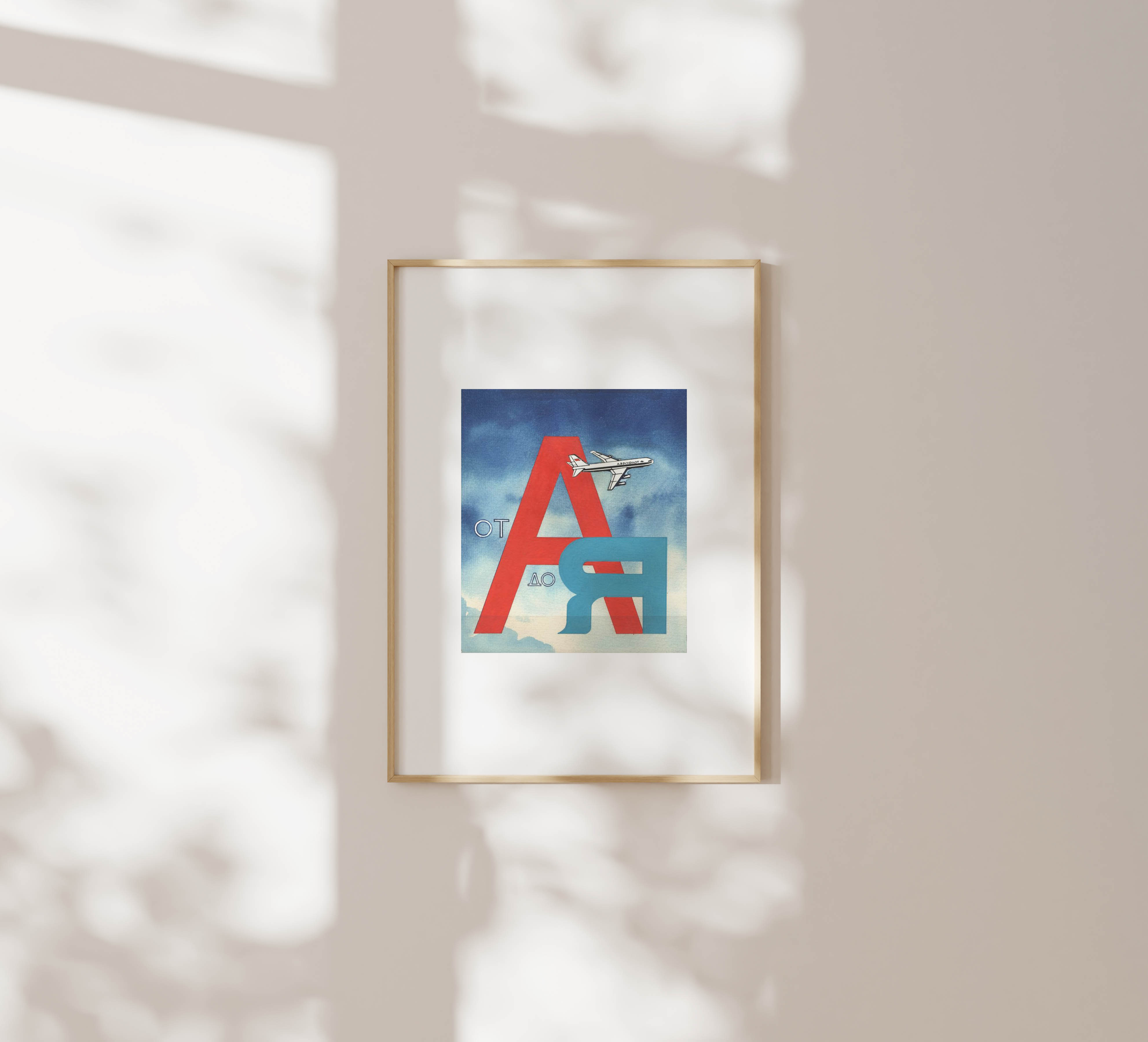
“Aeroflot from A to Z” (1970s) by G. Serebryakov is a tourism poster sketch that uses typography to make a clear point: Aeroflot flies everywhere. The Cyrillic А and Я—the first and last letters of the alphabet—suggest complete coverage, from beginning to end. A small paper plane, cut and glued onto the sketch, cuts across the sky between them.
The design is stripped down. Big red and blue letters dominate the space, each given weight by colour. A gradient sky washes behind them in soft brushstrokes, giving the illusion of altitude. Tourism posters weren’t just selling tickets. They were promoting the Soviet Union as modern, connected, and open to the world on its own terms.
Even sketches like this were reviewed for technical precision and ideological clarity. The stuck on aircraft is part of the poster-making process, where artists moved through hand-drawn stages before reaching the final print. The process was structured—pencil sketches, approval, full-color versions, and final printing. Each artwork was reviewed for technical accuracy and ideological fit before it could move forward.