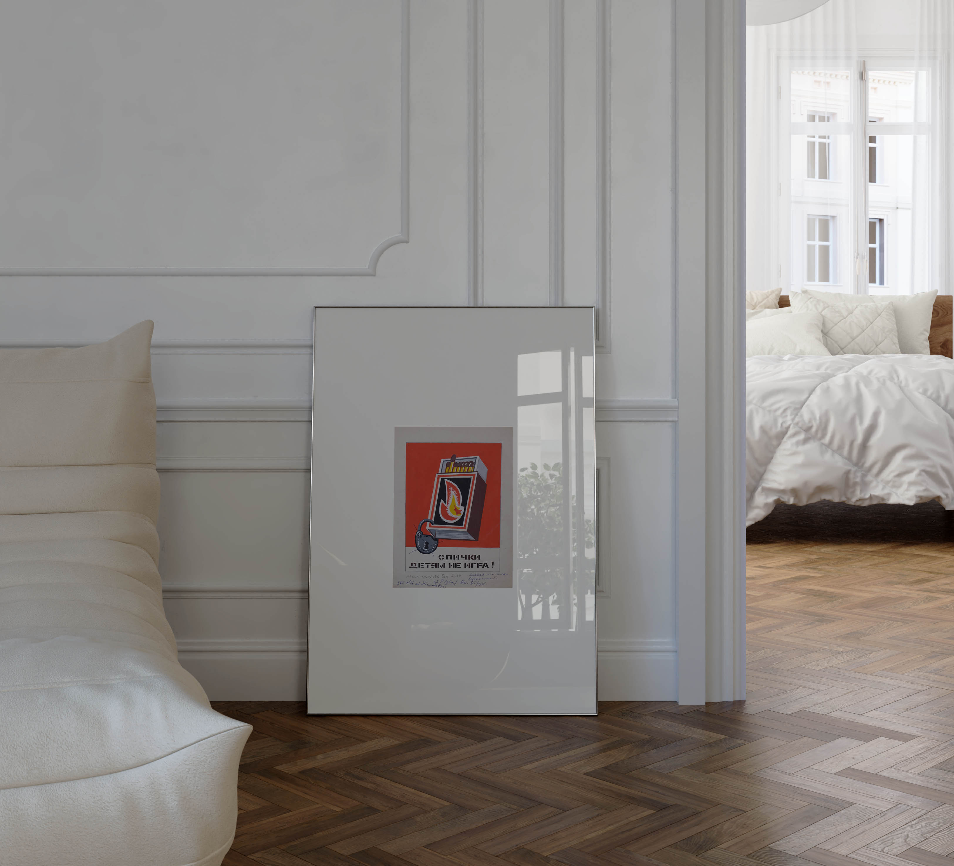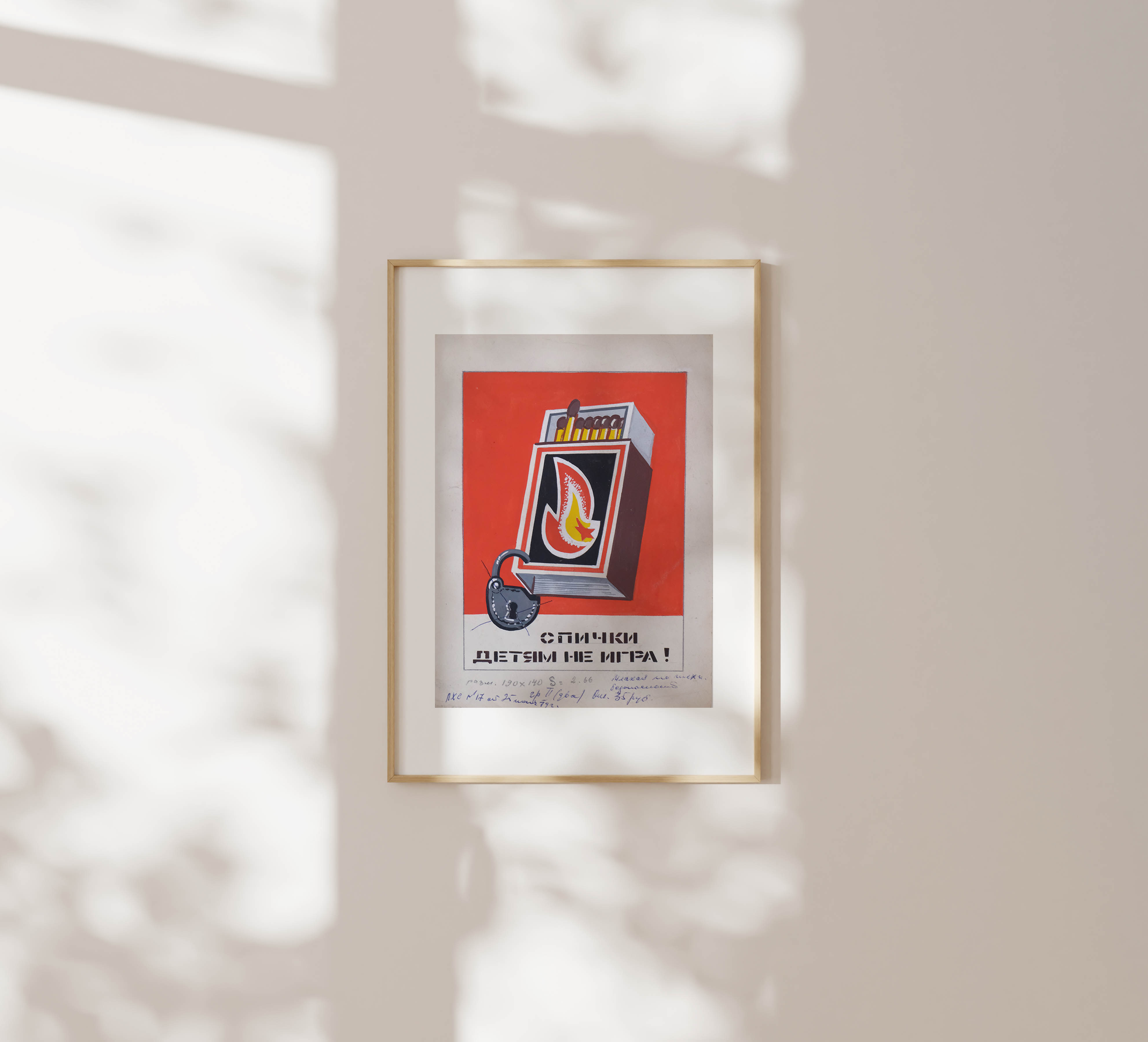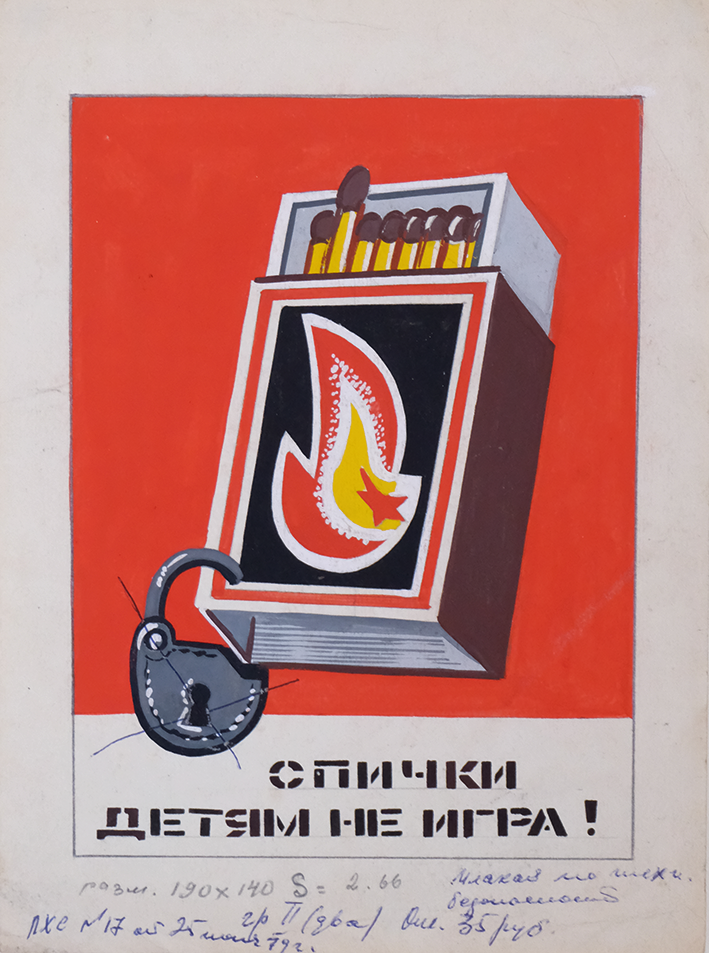
"Matches Are Not a Game for Children" (1970s) is a Soviet safety poster sketch that distills public messaging into a graphic that sticks—visually and mentally. These posters had to be legible at a glance, serious without being sentimental. Clarity, not nuance, was the goal.
A red matchbox bursts forward against an empty background, its open lid revealing tightly packed matches. Beneath it sits a black padlock, locking the matches away. The colour scheme is deliberate: red for urgency, black and white for contrast. Every line is sharp. Every shape earns its place.
Vasilchenko employs a controlled yet vibrant colour palette, with a bright orange fox, white-and-blue hare, and brown bear adding visual contrast while maintaining cohesion. His fluid brushwork combines simple, bold shapes with detailed expressions, achieving a whimsical tone well-suited for young readers. The watercolours are skillfully applied, defining each character distinctly against the atmospheric winter backdrop, embodying a departure from strict Socialist Realism toward a lighter, child-friendly aesthetic.
Trained under Moses Wolstein and Alexander Filbert at the Voroshilovgrad Art School, Vasilchenko brings a Ukrainian artistic sensibility to his work. His background in landscape and genre painting is evident in the environmental details, while his experience as an art educator shines through in the engaging, accessible imagery. These officially sanctioned illustrations reflect the high artistic standards within Soviet children's publishing, showcasing how state-backed projects could foster both creative integrity and cultural impact.
The handwritten notes and stamps at the bottom of the artwork document the poster’s review path: dates, approvals, and annotations by department heads. The process was structured—pencil sketches, approval, full-color versions, and final printing. Each artwork was reviewed for technical accuracy and ideological fit before it could move forward.
Posters like this emerged out of necessity. As the Soviet Union industrialised, safety was largely ignored. Accidents were common, and protective measures were scarce. As well as reform, the state turned to artists to create visual warnings—bold, instructive, and unavoidable.